Just like Final Cut Pro, Motion is a program I have never used before and as before I searched the internet for tutorials and after viewing a few I felt that I could do the basics within motion to help finish this project. I felt that I did not want to flood the screen with text to illustrate the speech. I do not like the idea of a kind of subtitle running through the video. I watched over and over my final edits in motion adding text just to highlight a word that I felt was important. I chose the font "Helvetica" I have a feeling that it can be seen as a kind of default font, but I wanted a font that would be unobtrusive, you see, read it, understand it and its gone, with no fuss. For my initial title and end words I have used "Hiragino Kaku Gothic std". I wanted a strong font that would allow the image behind to be seen and leave its mark as statement.
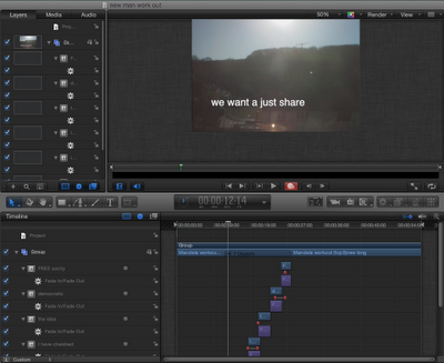 |
| Early edit with more text. |
|
I believe that I only scratch the surface with the work I undertook in Motion 5. What little use of it resources, I enjoyed using. I tried many test runs to aid my progress in learning about Motion 5 as in the example above. Nelson say "we want to have a just share". In this version of the text I have included the whole line.
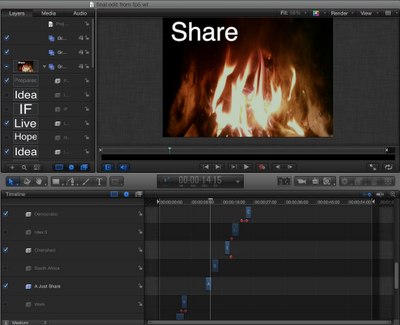 |
| One of the last edits |
In a later version I have increased the size of the font and cut the line down to just the word "share". As my understanding increased and the changes to my edits were only minor I realised that because of the layer system in Motion 5 I could import a new version and have it sit on top of the previous edit, then turning off both the sound and image of the previous edit allowing me to view the new edit and old text together. It may be a small thing but this helped my work flow a lot.


No comments:
Post a Comment