Saturday, 24 March 2012

Research from Clive Bonny

As part of the process we have been given a brief out line of what our client Clive Bonny would like to have on his website. We are now at the point where we have to find out more information. I have come up with a list of 17 question to help me in my understanding of what is required of the website. We were hoping to have a meeting with Clive but this has had to cancelled. Below are the initial question I wanted to ask.

1 What the prime objective of your web site.
2. Is this a training scheme for managing a project and in how to create product from recycled martial.
3 Who your target audience
4 Content do you have?
5. Do you have a brand logo for “Self made clothing support'
6 How do you source your clothes.
7 If you web site was a person what personality would it have.
8 Do you have any preconceived ideas about the website ie colour interactively.
9 Is the business/scheme already up and running.
10 Do you have any examples of finished products.
11 Does the web site have any connection to social media ie facebook twitter.
12 Does the website have to be geographical specific. Ie Brighton, south coast.
13 Are there links to journals trade sites.
14 Do you have any connection to ethical fashion forum.
15 What do you want to tell them about you.
16 Do you know the term up cycled.
17 Contact how?

 
As a group we have got together and combined all of our question which we have e-mailed to James Harvey at Links Creative who will forward them on to Clive Bonny.

General background question

1 Could you elaborate on what do you do as an organisation?
2 Is this a training scheme for managing a project and in how to create products from recycled material?
3 What are the project aims?
4 Who is your target audience?
5 What is the project background and history?
6 What activities do you run in order to enhance the person/s skills?
7 How long has the project been running? Do you have any previous success stories, testimonies available?
8 Are there a team of people who run the project? Would you want their skill/role background on the website? Any other participants?
9 Where do you currently operate?
10 Have you received any awards?
11 How do you currently promote the business/project?
12 Have you received any awards?
13 Do you know of any other projects similar to this?
14 How do you source your clothes?
15 Do you have any connections to social media, Facebook, twitter etc?You tube video promoted us
16 Do you want links to journal trade sites on your website?
17 Do you have connections to ethical fashion forum?
18 Do you know the term up-cycled?

Design Questions

1 What do you want the site to achieve/do?
2 Do you have a slogan/tag line? Yes
3 What do you want the site to feature content wise? Anything especially want/do not want on the home page, other pages?
4 If your site was a person what personality would it have?
5 What content do you have available for use? Images, video, documents etc.
6 How will people using the site get in contact? Do you have an email, address, phone number that you want to have on the site?
7 What words/phrases would you want to be able to search online for your site to come up? Which are more/less important?
8 Have you got a theme/colour scheme in mind?
9 Do you want to be able to have people sign up for email based newsletters?
10 Do you have a current logo (do you want a logo?), are you happy with it? Do you any other existing documents? Leaflets, business cards etc, that you would like the design to follow?
11 Have you seen any websites you like the look of?

Extra questions


1 Do you need to be able to update the website? If so how regularly?
2 Will you be advertising any partners/businesses involved in the project?


Friday, 23 March 2012

Website research


I chose to divide my website research into two areas. Firstly educational and training and secondly fashion.

Educational and training.

I looked at many educational and training website and my overall impression was they either based on lists with links or their pages were dived up by boxes with links inside to more information. None of the home pages where visually appealing, they all seem to cram as much information in as possible. All the websites seem very impersonal.
Educational & Training web pages
Recycled and Ethical fashion websites.


As with the educational web research I looked at many websites. My overriding impression was of Image rich text light and some were more catalogue like as the were selling their cloths online. Others were advertising for their shops. All website contain information about recycling and their ethical policies. All of the websites seem personal and people friendly.

Recycled & Ethical fashion pages

Tuesday, 13 March 2012

It's in the code

We started to learn coding, what we done may not seem fantastic to anybody who knows about coding but we all have to start somewhere. I not sure if I can tell all that I have been told but I can explain some of the things I have learnt.
First code work
 
The !DOCTYPE html tells the browsers that the coding is html. The next line is html lang=en the denote the default language is English. meta charset=”utf-8” it is using charterer set utf 8. All of this information is in an area called the header. It is unseen on screen and is only there to help the browser. Each line of code has an open tag <> and a closing tag </> the closing tag denoted by the forward slash. As we can see in the head tag <head> opening tag, </head> closing tag.

The second area of coding is the body, which contains headings <h1> and paragraphs <p> and unordered list <ul> as well as the list it self <li> . There are also a link to other pages denoted by the <href=” “> . As you can see from the coding that includes a page called “picture” and one called “video”.
Page display from code
Normal this page would display with a white background and with black text. However we have introduce another element in this web page and that is the use of a style sheet. This is a supplementary coding that give style to elements on the page and can be applied to all pages in one simple piece of coding. 
Style sheet code
The web page when read by the browser read from the top to the bottom and follows instructions as they are given. Line 7 indicates that there is a style sheet and where it can be found. The browser reads the style sheet and applies it to the coding, it then reads on after line 7. It applies these styles unless otherwise instructed to do so. Briefly it say to the body apply this criteria: “ background color powder blue”, “text to be gold”, use the font family Helvetica neue if you can't find that font on the browser use Arial, if you can't find that font use Helvetica and on to the next choice. For headings 1 <h1> and headings 2 <h2> use Georgia, if not the others in the list. For the list style character I have chosen Katakana iroha just to display some thing completely different so it stands out and helps me understand the process. After writing this I am a little clearer about coding.


Sunday, 11 March 2012

Client

Our tutors have now assign clients to the class. Mine is Clive Bonny The project is Self made creative clothing. We have been given an initial prospective brief from first steps. Self Made Creative Clothing supports and acts as a catalyst for projects helping learners of all ages with creative, innovation and entrepreneurship using low cost accessible clothing materials and other associated recycled resources. It is a programme that will act as a boost for social/sustainable enterprise and help to improve employ ability amongst young people. We will have to design a media rich website to show case the project aims, its background, participants,activates and outcomes. I believe the target audience ill be Students employers and people interested in recycling, sustainability and enterprise.

As a group we will have a meeting with Clive Bonny to better define our brief.

I have done some initial research on Clive Bonny. He is the founder and principal consultant of strategic Management Partners an independent consultancy. They provide strategic planning advice, training, coaching and support to organisations both large and small, across a wide range of sectors. We are based in South East England and provide services to an international client base. He has over 25 years commercial experience in delivering bottom line benefits for client teams from the MD to the receptionist. Many years advisory experience with Investors in People, Innovation and Enterprise Agencies has produced many national award winning projects. Clive has delivered over 50 government funded business growth schemes for small to medium sized businesses through enterprise support programmes. Clive also works closely with large corporates and the public and not-for-profit sectors.

Thursday, 8 March 2012

Developing a web site for a client


For this assignment I have been given a client to produce a web site for. These clients are working with a company called First Steps, who have negotiated the individual briefs with the clients, so they will be briefing us on the nature of the clients’ requirements on the first day of this project (Monday 5th March). During the project I will be liaising with the client and with First Steps we will have a set of agreed deadlines for research, ideas, mock-ups and a prototype. A record of my correspondence with the client, including any feedback they have given me, will be presented in my blog.

There will be groups of up to 4 students working on each project, but we are working competitively rather than collaboratively. Our tutors will allocate us our group and client. We will each be working individually to answer the brief and produce a website suitable to the client’s needs, though we may need to generate content for the website collaboratively. The client will ultimately choose one site they intend to use professionally (as long as there is one which is suitable to their needs and produced to a high enough standard).

I will build my web site using html and css in a text editor, such as Textwrangler, and the graphics will be made in a Photoshop and/or Illustrator, then compressed for the web. I will build and develop the skills to provide a sophisticated interactive user experience in this website. This will mean I can introduce interactive image display features such as remote rollovers and lightboxes, as well as enhancing the interactivity with features such as animated transitions using jQuery and CSS3 techniques.
For the typographic elements of your design you I use webfonts using either @fontface or Google Web Fonts.

We will have to use the First Steps initial briefing on the client and their requirements as the terms of reference for our visual research and the development of your designs. It is important that I gather a strong set of visual references for the subject area with which I am dealing and that you I make clear and cohesive decisions about the appropriate visual language I use.

Friday, 2 March 2012

Final thoughts Evaluation

I enjoyed this project. I felt with the limited resources of the camera I have created a creditable piece of work. I have enjoyed seeing what others are capable of creating. The hardest part was getting to grip with new software and lastly the discipline of recording my work in my blog and sketch book. I enjoyed making this video and I hope you enjoy watching it.


Crit

As before I enjoyed crit on many levels. I always enjoy seeing other people work and the fact that we all came up with such verity of different ideas for the same project. I liked Jamies work, he has a thoughtful and well executed style. However I did feel that the text in places was a distraction to his well shot and edited video. I enjoyed the second of Mike's two video the first I felt was a little bit manic and the second gave you time to breath, I liked it feel the style and filters he used. Russel also employed and old fashion look to it using and old film filter. I felt that some of the cuts needed to be sharper and I was not keen on the music he chose it was to loud in the mix for me. When I came to the crit on my project some felt that the inclusion of the dead pigeon and the leaves vignette should not be in the video. I felt that I was trying to stir an emotion, reflecting on the terrible things that had happened in South Africa. Maybe it was a little to strong so I have changed that part of the video. With regard to the text it was felt that the text should have the feeling of being knocked out of the way by the next cut. This happened in one place in the video and so I have re-timed and repositioned the text to give that feeling throughout. Lastly that  I should change the font used for the word "DIE" to Helvetica in keeping with the overlay text. I have done this and at the same time changed the word Mandela to Helvetica too.

Second half

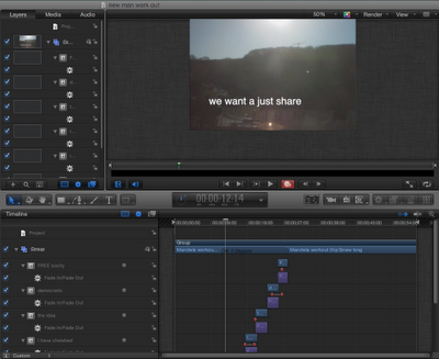
Just like Final Cut Pro, Motion is a program I have never used before and as before I searched the internet for tutorials and after viewing a few I felt that I could do the basics within motion to help finish this project. I felt that I did not want to flood the screen with text to illustrate the speech. I do not like the idea of a kind of subtitle running through the video. I watched over and over my final edits in motion adding text just to highlight a word that I felt was important. I chose the font "Helvetica"  I have a feeling that it can be seen as a kind of default font, but I wanted a font that would be unobtrusive, you see, read it, understand it and its gone, with no fuss. For my initial title and end words I have used "Hiragino Kaku Gothic std". I wanted a strong font that would allow the image behind to be seen and leave its mark as statement.
Early edit with more text.
I believe that I only scratch the surface with the work I undertook in Motion 5. What little use of it resources, I enjoyed using. I tried many test runs to aid my progress in learning about Motion 5 as in the example above. Nelson say "we want to have a just share". In this version of the text I have included the whole line.
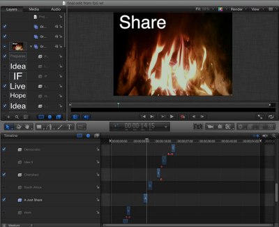
One of the last edits
In a later version I have increased the size of the font and cut the line down to just the word "share". As my understanding increased and the changes to my edits were only minor I realised that because of the layer system in Motion 5 I could import a new version and have it sit on top of the previous edit, then turning off both the sound and image of the previous edit allowing me to view the new edit and old text together. It may be a small thing but this helped my work flow a lot.

Thursday, 1 March 2012

Organising my work

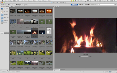
Once I started this project it became very apparent that my work flow had to be more organised. The camera that I was using would auto label the clips Sunp0001.avi changing the number for the next clip. After down loading to a folder and deleting from the memory card it would return to Sunp0001.avi. So I gave every clip a new name using Adobe Bridge This allowed me to view on in larger format than the thumbnails in the folder on my mac and I did not have to open them in QuickTime if I wanted to see them larger. I cold also delete the ones I was clearly not going to use.
Renaming and sorting clips in Bridge
In our tutorials in the class we were advised to convert the files using compressor to Apple Pro Ress 442
this would give a smother result when being edited in Final Cut Pro. During the editing process I used Final Cut Pro X having never used editing software before I found FCP X easyer to use than FCP 7.
 At the very start of project I had edited the speech in Sound Track Pro, I kept all of my sound clips in a separate folder, it also included the music and the cut out section of music I used in my clip. Lastly I kept the original still images in another folder. The speech I had saved as a word document so I could copy and paste word and sentences when I used Motion to add the text to my final edit.
Time lines from FCP X
One of the most helpful things in FCP X was the facility to copy and save different versions of the time line allowing me to return to a previous edit if I was not happy with the direction I had take in the choice of clips and effects. The same could be said for Motion 5 I could import the new clip and hide the old clip and use the text movements I had already created.

The sense of travel

In my original thoughts I want to have the sense of travel. In one of my work in progress edits I had fade transition between each shot. I was thinking about having the tripod on the car seat and filming the sun through the window.  However I did think this was going to be difficult I would have no control over the filming I would have to find a driver or a different method. I had planed a day in Brighton and traveled by train taking my video camera with me. As the train pulled out of Lewes station the light started to flicker I pressed the camera up against the window I shoot many sequences and chose the best to use as my new transition in the video.
 
Train movement

Green screen

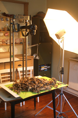
Green screen set up

I was not happy with image I had shoot of the newspaper under the leaves. So I decided to try and shoot the leaves against a green back ground aka green screen. I have an old photo copying stand and lights and set these up in the kitchen, The garden shed to cold this time of the year. I covered the green paper with dry leaves from the garden. Set my still camera to auto and locked the focus. I used the flash on the top of the camera to fire the flash pack.  I shot a sequence of images after each image I would move the leaves clearing a space in the center. Once the center was clear I shot a sequence with leaves coming back together. I then imported them into Photoshop stacked in layers via Bridge. Using the animation setting I animated each layer to create a moving sequence.
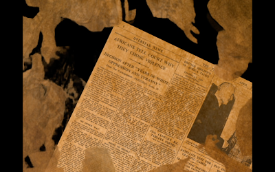
I was now going to import the small mov I had created into Final cut pro and superimpose it over a still image of the news paper. However in the mean time I had shot a sequence of a dead pigeon and its feathers. It had been attacked by a kestrel. I felt that the leaves would act as a vignette highlighting the dead bird and driving home the feeling of death. I then went through the same process again, but used torn up news papers and have over laid this image in my sequence.
Newspaper sequence