Wednesday 30 October 2013

Fonts


Having chosen a theme for my app I have looked around for a font I can use to give the feeling of a rubber stamp. I had initially tried to convert text in a box in illustrator to look like a stamp. This proved to be a long process and I was not happy with the results. On my initial search at dafont website a font called 'Old Stamper' seems to fit the bill perfectly and so I have looked no further. The font seems to be donation ware if the project where to go ahead I would contact the author with regards to rights of the font. However they have left a note indicating what you can do with the font in the download package..

“My Fonts Are free to use personal and commercial works to. But you can't sell them directly.
Please don't make illegal copies of the fonts.
Thankx and regards: Koczman B·lint (Cpr.Sparhelt)”

Illustration © Magique Fonts
The font will not need to be embedded as it will make up part of the art work. The other font I wish to use is American typewriter, this is an embedded font in the ipad system. It will be used as part of the readable a scrollable text.
American typewriter font

Saturday 26 October 2013

Further research in to iso7


I found a few weeks back a web site from a guy called Matt Gemmell here is a distillation of some of the things that I have read in research into app design and iso7.


Matt set out to talk about the difference between iso6 and iso7 give so thoughts into design.
Colour V Boarders, iso7 seems to rely on colours to indicate interactivity and dividers to organise information. Controls are based on labels or icons which are elemental and presented as outlines. He says legibility and calmness are the order of the day, while some are complaining that slender typeface is the default, it may be changed globally for apps that support that feature. Itis obvious that the iso id design to make best use of the retina display.


Iso 7 may have a flat look to it, however there are subtle shadows, gradients and lighting effect and an optional parallax effect allowing the icon floating above the background to appear above the back ground. The focus is on function rather than form. He say table aren't so obviously controls, rather list of things. The strongest difference is the non use of bevels, grip-handles embossing, shadows, fake gloss, inner glows and hard button boarders. 60% of screen real-estate is taken up by these artifacts in iso6 compared to iso7 just look at the interface for receiving a call.


Clean look allows to see more of the callers photo
 The visual weight is much lighter, there is an overall sense of openness. The new icons are are not fussy, distinct and identifiable. He believes it a shift away from artefact back to essence. There is simplicity that brings focus and clarity. He pass his judgement on the over use of well worn toolbox of simulation and explicitness and say ' We too easily forget that the only thing that matters to people are their goals: their own tasks, and content. With limited attention, we want to devote our focus to what’s important, rather than distractions and artifice masquerading as design traditions.'
 
Ref: http://mattgemmell.com/

Thursday 24 October 2013

Planning


I have to present my planning for the app this week, this must include wire frames, flow diagrams of the app. The App is about the people who witnessed the assassination of President Kennedy in Dallas in 1963. It is the eyewitness who the story is about. The key elements are who are they, what did they say, where did they live at the time and some period information, ie newspapers and media from the time.


Flow diagram
The app opens with a 360º panoramic of Dealey Plaza viewed from the middle of the road, so the only person you don't see is President Kennedy. This the key interface that takes you to the information about the witness. You can either navigate to the witness page by touching the witness or swiping up from the bottom of the ipad to reveal a list of names. This allows you to take a short cut to the witness info page. From the witness main page you then have four options, newspapers, Original documents, Tv or radio and lastly maps. Newspaper will be a collection of newspaper from the time. You will be able o read only the front covers. The original documents will be copies of witness statements from the time and any other historical documents relating to that witness. Tv or radio will original content that was generated at the time which is either audio or visual. Lastly a map of the area that they lived in and an image of their house to show you some context to their background.


Wire frame.
As you can see in the wire frames presented above The first window is the 360º panorama of Dealey Plaza. After 3 seconds arrows will indicate that you can change the direction of travel. The second window shows the active elements on the screen. These are the witness links to their info page. The third window displays the up swiping of the ipad to reveal the short cut menu. The fourth window is the main witness window, included on this window is the navigation on the bottom. The name of the witness on the top. The bio information in the middle and a place holder for their photograph. The fifth window is the first of the info pages in this case it is the map page layout. The sixth window is news paper layout.


Wire frame two
The seventh window is the video or audio layout. The eights window is the original document layout. Lastly the short cut menu which can appear on all of the info pages so as to take you to any other witness.


Content


I have found quite a few websites that have information about the assignation and will harvest them for content to populate the app. Here are a few to give you a flavour of their content.


http://jfkassassination.net/russ/index.htm
http://www.blather.net
http://www.jfk-info.com/index2.html


Planing for the coming week weeks


13th November hand in of the story boards
Before I will have the design and look clarified. Contents will be gathered. Panoramic will be complete and working.

27th November Crit of our visualisations.
Before I will use the storyboards to generate a working visualisation. And finis ang elements that need tweaking from the submission of the storyboards.


2nd December submission.


All has to be done and dusted will gather all element to populate my sketch book pdf.


Monday 21 October 2013

Reviewing narrative for app


I have been reviewing my choices for the narrative to be used in the app. I have dismissed the linnea book as it already has a strong branding and in one respect I would be reinventing the wheel. The idea of illustrating Richard Feynman would be fun but I think there would be a large learning curve to do with physic and I would not be putting my efforts into understanding the content of the app rather than the design and usability of the app. The same could be said for the ladybird books. Before I make my final discussion and embark on my project I made a small presentation of the life of Alberto Santos du Mont to see if others would find this an interesting subject.

Part of presentation for app

I informally asked people for some feed back after showing them the presentation. The strongest reaction was why have we not heard of this guy. That's interesting. I would like to know more.
Dealey Plaza 1963
I have had an interesting week. from a chance conversation I have decided to go in a completely different direction. I was talking about the idea of collective narrative and had made the suggestion that the people who witnessed the assignation of president Kennedy could make an interesting narrative.  All those people focusing on one event all have many different narratives about themselves and the event. I only have a few day to plan all of this as I have a planing meeting on Thursday.

Saturday 19 October 2013

Icons and tab bars


Apple provide a description of the how they would like icon and tab bars to look. They show example of standard buttons.
Examples of buttons
In keeping with key element of iso 7 a tab bar is translucent and always appears at the bottom of the screen. Must display no more than 5 tabs on the iphone. The tab bar should maintain the same heigh in either orientation.
Tab bar image
Target size of the button. Apple recommend that a size of 44 points, important elements should have a hierarchic. The most important being at the top right hand corner and the least important being at the bottom left hand corner. Using visual weighting is another highlighted aspect. Larger items appear more important than smaller items they catch the eye more quickly and help the use lock on to the element you want them to use first.
The apps icon.
The key element to the the apps icon is the imagery should be easily recognizable in keeping with the iso 7 feel keep it simple and create an abstract interpretation of the app. Make it look good on a verity of back grounds. Icon should be opaque and do not use iso interface elements in the art work and don't use ios app icons in the inter face as this can lead to confusion.
Before and after rounded corners
Size of the icons should be 152 x 152 Retina screens and 76 x 76 for the standard screen resolution.
The icon should have a 90º corners. Apple suggest that you also create an icon for in store display in two sizes 1024 x 1024 pixels and 512 x 512 pixels for their standard resolution.

Ref: MobileHIG pdf from Apple

Thursday 17 October 2013

ipad Gestures


Gestures are the key element for you to communicate with ipad. We learn through repetition and so the gesture. While it is possible to create new gestures apple recommend that you use the gestures inherent in the iso, Apple set a guide lines for the gestures for their devices. Here are the gestures and I will use them in this format except swipe with one finger, this will move an element on the page.
Tap To press or select a control or item.


Drag To scroll or pan—that is, move side to side.
To drag an element.
Flick To scroll or pan quickly.
Pinch Pinch open to zoom in; pinch close to zoom out.
Touch and hold In editable or selectable text, to display a magnified view
for cursor positioning.
Swipe With one finger, to return to the previous screen,
to reveal the hidden view in a split view (iPad only),
With four fingers, to switch between apps on iPad
Shake To initiate an undo or redo action.


Double tap To zoom in and center a block of content or an image.
To zoom out (if already zoomed in).

Monday 14 October 2013

Inital planning ideas

Planning 

This the start of my planning for my ipad app. I have broken it down into a few elements.

Story

Outline, Key elements.
I will look at the whole story that I am going to turn into an app. Picking out the key elements that will be important enough to warrant either a page or sub-page in the app.

Associated research

Location of story, Period and style of time. Key events. Resources

Location could be a key factor in the narrative. The period and style may give hints to the look and feel of the app. Key events may add some back ground and enhance the story. Resources that can be exploited to add other dimensions to the app, photos, newspapers, sound recordings and videos.

Visual ideas

A good stating point for visual ideas could be the period and style that the narrative is set in. The target audience my hint at a style and feel that would appeal to them and or a combination of both.

ipad

What can an ipad do, Current apps, Apples iso guide lines for apps.

Understanding what an ipad can do the types of media it will play its interactivity with the user. Its connectivity, WiFi, Bluetooth and internet may shape the elements in the app. Is their already an app of my idea, what do other apps look and feel like. Are there elements that I could use in my app, navigation and content comes to mind. Lastly what constraints and design considerations have to be look at before creating and designing my app.

Flow diagrams

Flow diagram for an iphone app


I will produce a flow diagram to indicate navigation and headings for content.

Wire frame

Example of wire frame


I will produce a wire frame to show the position and layout of elements on the screen. Where button will sit and their actions. This will not contain any visual content as it is more for position and whats behind the elements and buttons.


Reference Wire frame
                 Flow diagram


Monday 7 October 2013

Story ideas


One of the stories I looked at.

I Had a few thoughts about the story/narrative I might use for this project. My first though was a children’s story and all of the examples already had strong visual elements attached to them. One either had to use a generic story that many people had covered i.e. 'Goldie locks and the Three Bears' and generate a new visual for it, perhaps giving a twist to the story so it could be adapted to this project.

My Second thought for app
I soon left that idea behind the next thought was something that would stimulate me. I have always been a fan of physicist Richard Feynman I thought I could adapt his basic lectures on physics to make an interesting app. 

Cartoon from Vanity Fair
Still in the non fiction area I found a book at home about a Brazilian aviator who flew around the Eiffel Tower in a balloon and designed and built a plane in 1906, becoming the first person to fly in Europe and in public. He is an interesting character and could make a interesting subject for a book.
Ladybird activity books
My last though was to update one of the Laybird books I remember as a child to do with Electricity and Magnetism. Turning the pages into an interactive app.


Sunday 6 October 2013

The ipad

Introduction to the ipad

At this present moment the ipad come in three different basic configurations, extra choices can be the size of internal storage 18gb 32gb 64gb and their connectivity, WiFi cellular or 3G. The original ipad is no longer available, however apple sold 15 million prior to the introduction of the ipad2
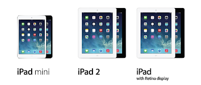
Three types of ipad

Screen & resolution

ipad1    9.7-inch 1024x768 resolution at 132 pixels per inch (ppi)
Mini     7.9-inch 1024x768 resolution at 163 pixels per inch (ppi)
ipad2    9.7-inch 1024x768 resolution at 132 pixels per inch (ppi)
ipad      9.7-inch  2048x1536 resolution at 264 pixels per inch (ppi)

Therefore all screen have the same aspect ratio 4 by 3.
All have multi-touch display

Processor

ipad1    Apple A4
Mini     Dual core A5
ipad2    Dual core A5
ipad      Dual core A6x with quad core graphics.

OS

ipad1    iso 5.1
Mini     iso 6/7
ipad2    iso 6/7
ipad      iso 6/7

Environmental sensors

ipad1    Accelerometer, ambient light sensor, magnetometer,
Mini     Accelerometer, ambient light sensor, magnetometer, gyroscope
ipad2    Accelerometer, ambient light sensor, magnetometer, gyroscope
ipad      Accelerometer, ambient light sensor, magnetometer, gyroscope

Cameras

ipad1   None

Mini    Back 1080p HD still and video camera 5 MP, 30fps and 5× digital zoom
            Front 1.2 MP still, 720p video

ipad2   Back 720 p HD still and video camera 0.7 MP, 30fps and 5× digital zoom
            Front VGA-quality still and video camera, 0.3 MP

ipad     Back 1080p HD still and video camera 5 MP, 30fps and 5× digital zoom
            Front 1.2 MP still, 720p video

Wireless

ipad1    Wi-Fi (802.11a/b/g/n), Bluetooth 2.1+EDR
             3G cellular HSDPA, 2G cellular EDGE on 3G models

Mini     Wi-Fi (802.11a/b/g/n), Bluetooth 4.0
             3G cellular HSDPA, 2G cellular EDGE on 3G models
             3G transitional LTE on 4G model

ipad2    Wi-Fi (802.11a/b/g/n), Bluetooth 2.1+EDR
             3G cellular HSDPA, 2G cellular EDGE on 3G models

ipad      Wi-Fi (802.11a/b/g/n), Bluetooth 4.0         
             3G cellular HSDPA, 2G cellular EDGE on 3G models
             3G transitional LTE on 4G model


Geolocation

ipad1    Apple location databases
Mini     Apple location databases GPS GLONASS
ipad2    Apple location databases GPS
ipad      Apple location databases GPS GLONASS

Sim card

ipad1    Apple location databases
Mini     Nano sim
ipad2    Micro sim
ipad      Micro sim


Connectors

ipad1    30-pin
Mini     Lighting
ipad2    30-pin
ipad      Lighting

Reference 

http://en.wikipedia.org/wiki/IPad
http://store.apple.com/uk/ipad/compare


Friday 4 October 2013

Assignment Brief

My Fda studies has now transferred into a Ba in digital media design. We now start our new project.

Introduction


Tablets are become very popular device for interaction with the web and down loaded content. In the first quarter of 2013 Apple sold 19.4 million ipads. With its ability to display and play many types of media it is becoming the devices of choice for most people to use.

Our Brief


We are going to design an interactive story/narrative for the ipad. We can take an existing short story or narrative and adapt it to be interactive. This can be aimed at any target audience and can be fictional or non fictional . We must consider my target audience and evidence this in this blog. I will prepare and visualize my story so that a developer can interpret my design and do the necessary coding. I will include wire framing (flow diagrams) and story boarding my app with details and events that need to take place on each page. My story board can be had drawn/painted style initially, however I must produce a story board using digital methods. Lastly I will need to produce a dynamic visualization of my story in order to pitch and demonstrate how it will work sowing detailed examples of animated content.

Technical considerations


I will have to consider usability and user experience involved in designing for the ipad. I will produce samples of user testing hand outs/ questionnaires and will produce evidence of technical options and constraints that the developer of such an app might encounter. Taking into consideration iso guidelines what are the difference for designing for this medium how do I tackle various the different screen sizes the ipad come in. All of this evidence will be provided in this blog.

Important dates


Thursday 24th October – Deadline for planning
Wednesday 13th Nov pm Deadline for storyboards – complete and final hand-in
Wed 27th Nov pm Crit
Mon 2nd Dec 5.pm Deadline