Duke of york cinema. As we move down
the London road we have the old Co op building, the now reused
Woolworth building. The 1930's building currently being used by
MacDonald. Lastly St Peters church. This also defined the boundaries
of my project coincidentally following the 2009 project.
 |
| Key elements of London Road. |
The first element I found that inspired
me was a poster from the 1935 film Brighton rock. I felt that the
area needed an up market music venue. I also looked at other film
posters.
 |
| Film Poster used for inspiration. |
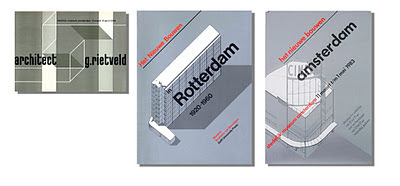
The next element that I came across was
a poster for Dutch museum exhibition of architecture by Willem
Hendrik Crouwel. I loved the clean and simplistic design. I believed
it would be ideal for a project that did not contain the elements of
a normal redevelopment ie, artistic drawings based on architectural
designs.
 |
| Designs by Willem Crouwel |
No comments:
Post a Comment