Friday 27 April 2012

Final website


I have revamped my site after the crit we had the other day.  As you can see from the screen grabs I have extended the tape across the whole site and added colour to make it more distinctive. The Logos and images on the left had side are smaller and this subtle change works well. I have added a drop shadow to the text boxes and the background image now extends over the whole site toning down the overall whiteness.
 I have to say I am very happy with the overall result and feel I have achieved what I set out to do.

Thursday 26 April 2012

Crit

The day of the crit has arrived. For me this has been the most technically challenging project so far.With all the others I felt I had some understanding of the programs we had to use and the flow the work would take. How ever all of this was something new.
Screen shot of first page.
As you can see this is the first page of the website it has the text incorporated and logo added I think it has achieved what I wanted to do. To produce a clean easily read a concise and informative website.
The Gallery page.
 The other page I have chosen to display is the gallery page when you hover over the image the text appears on the label on the left.

The crit  this time seemed to be a quieter affair I think some found this project quite hard. As with the last project people came up with many different ideas for the same project. I liked the play group project Lucys and Haleys and Corinne all had interesting images on their footers evoking the feeling of nursery wall paintings. Jamie had a very strong and eventful site and had undertaken many challenging technical elements. Chelsea I felt had a very strong design  to it she used the idea of a cork board to pin all of her images and text on. I think the were a few thing just a little on the small side as they seem to get lost against the background. This time I was not so happy with my crit. The main thoughts were that there was too much white. The logos on the left where to big, some people did not like the way each header changed colour for each page. I can see that when you put a lot of effort into some thing its hard to step back and see the wood for the trees. I knew they where right with their criticism but  for a short time it upset me. Upon reflection this is the hardest part, being able to see your own work through other people eyes, can only help with your own design decisions.


Trying some design elements

I have design a logo for the header of the web page. I want to include some other elements to go on the page. I though about making buttons in the style of the Levi jeans buttons. I am thinking of using this elements as bullet points in support of the text.
Button logo
One of the members of the group that I am working with has used a label to display information. Inspired by this I have created a logo for Self Made Creative Clothing.
labels for SMCC

At the moment I feel to use these elements is moving away from my initial feel of the design. But it was fun to try.

Thursday 19 April 2012

Some parameters for my pages

After consultation with my tutors and looking at the statistic on w3school.com I come to the conclusion that my web page will be 960 by what ever it falls. This will display the site in the middle of the screen on the majority of computers. It will have a colour depth of 16 million colours. It will take into account that it will be viewed on most of the popular browsers. 
See chart.

 
I have made a dummy page layout showing where the key elements will be placed. The only page that will be different will be the gallery page as this will swap over the placement of text and images. This is because the images will need to be larger than the text.


Friday 13 April 2012

More design development

I wanted to to use the tape measure as part of my navigation bar. My original version I scanned from a real tape but as you can clearly see there is a kink in it so I have made a new one in illustrator.
New and Old tape
I been looking at the logo I am going to use as a header and have experimented with the text changing it to see which best suits the words and layout. Through development I arrived at the image at the bottom for my header. As you can see I also tried different backing materials other buttons and less pencils from my original idea.
Header experiments

Tuesday 10 April 2012

Corespondents

My client Clive Bonny has sent us a lot of information he wants included on the site. There is far to much to include. so I have edited the text and created a format the coveys the ideas he wants to get a cross.  I set out the text as they would appear on the site under the headings of each page.
Page 1
Page 2
Page 3


Above are a few of the pages I have sent. He replied that everything fine except for a few typos on page 1. Now all I need to do is incorporate the text into my web pages.

Friday 6 April 2012

Pitch

We had to pitch our project in front of our clients. I have prepared a pretension in Keynote. The main trust of the pretension is the site has to be direct and to the point not overly fussy. It must appeal to teachers, employers and companies who wish to be involved in providing help and sponsorship. It must also be of interest to the more mature students who would consider this a worthy project to be involved  in.
Mock up of webpage
I have made a mock up of the web page in Photoshop and will now transfer this idea to the code I will generate.

After the pretension we had the opportunity to speak to our respective clients. I found this very helpful as we were able to get a better understanding of what he required from the website. He wanted us to stressed entrepreneurship content of the site and how the project outcomes would appeal to prospective employers.

Monday 2 April 2012

Accessibility and SEO

Accessibility

Accessibility is the practice of making website useable to people who may have a disabilities and they are able to use the website in spite of their disabilities. For those who have problems with their vision texts to speech program are able read the images which have a text prompt embedded. The colours that used and the contrast between the text and background have to be taken into account.

Search Engine Optimization
 
Web search engines such as Google, Yarhoo and Bing, are designed to search for information on the web. Using search engine optimization is a way of improving you ranking when searched is undertaken. Having your website nearer the top of the search list the more people are likely to visit your site. Leading search engines us some thing called crawlers to find pages for their algorithmic search result. Increasing prominence will gain more hits on your site. Cross linking between pages on the same site may improve its visibility. Writing content that includes frequently searched keywords. In the case of our websites words such as recycled, upcycled, will hits in combination with fashion, ethical all pointing you in the direction of that type of website. Lastly adding key words to a web pages meta data. Included in the title and meta description.


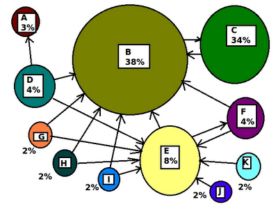
Search engines uses complex mathematical algorithms to guess which websites a user seeks, based in part on examination of how websites link to each other. Since website B is the recipient of numerous inbound links, B ranks highly in a web search, and will come up early in a web search. Further, since B is popular, and has an outbound link to C, C ranks highly too.


Sources:-
Search Engines
Search Engines optimization
Web Accessibility